01 — Logo
The Nabooki Logo
Our logo is the most recognisable expression of the brand. Use the lockups, clear space, and background rules below to keep it consistent everywhere it appears — web, print, decks, and partner materials.
Logo Lockups
Primary Wordmark
Navy #011166 · min 100px high
Reversed Wordmark
White · for navy & dark imagery
Secondary Mark
Min 150px high

Submark
Min 150px high
Approved Backgrounds
White — default
Navy
Oat
Amber Dune
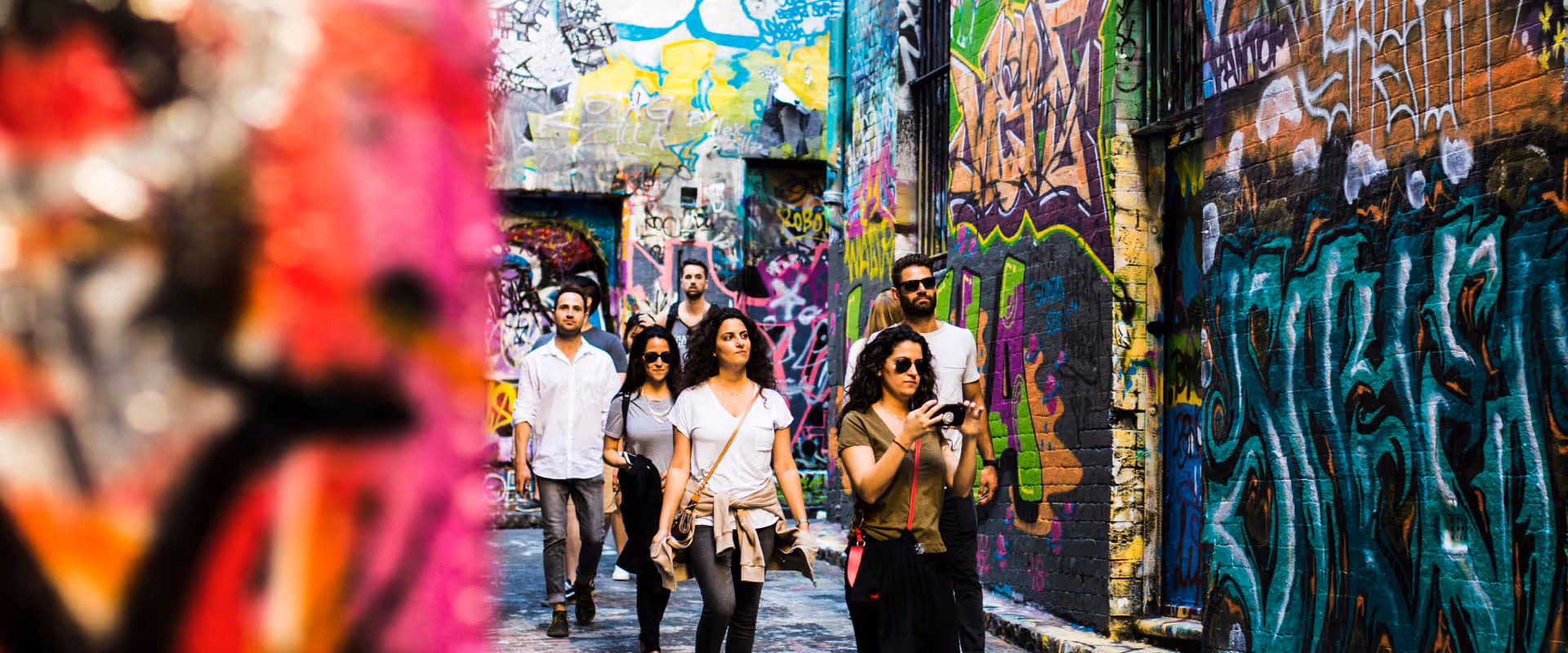
Logo on Imagery
Place the white logo over darker, low-detail areas of a photo so it stays clearly visible. Avoid busy or light backgrounds that swallow the mark.
Do's & Don'ts
Don't rotate or tilt
Always keep the logo level and upright.
Don't stretch or distort
Scale proportionally — never squash or stretch.
Don't recolour
Use only navy, white, or approved palette colours.
Don't use low contrast
The logo must never blend into its background.
Don't add effects
No drop shadows, glows, or outlines.
Do keep it clean
Approved colour, clear space, upright, full contrast.
.avif)
.avif)
.avif)
.avif)
.avif)

.avif)


.avif)